|
|
Column Graphs
Graphs are very helpful when displaying and interpreting information. There are many types of graphs and its important to choose the one that is most suitable.
When constructing column graphs, they should be drawn on graph paper and have: 1. a title 2. labelled axes which are clearly and evenly scaled 3. columns of the same width 4. an even gap between each column 5. the first column beginning half a unit (that is, half a column width) from the vertical axes The same principles apply for a bar graph. |
Sector Graphs
Sector graphs or pie charts are quite distinct from any of the graphs we have looked at or worked with so far. Theses graphs have no vertical or horizontal axes. Sector graphs are used to display the different parts or portions which make up one whole of an object or event. They are called sector graphs as they are made up of sectors of a circle.
Reading sector graphs can be difficult as there is sometimes limited information. We are able to determine the proportion (fraction) or percentage of the subjects. When drawing sector graphs, it is important to remember that the more information you can show, the easier it will be to read. To read an unlabeled graph, you will need a protractor, and remember that there are 360 degrees in a circle. To determine information about a sector, follow these steps: 1. measure the size of the angle of each sector of the graph 2. express each of the angles as a fraction of 360 degrees 3. simplify the fraction if possible, this is called the proportion 4. multiply the fraction by 100%, this is called the percentage |
|
|
|
Line Graphs
So far we have looked at graphs that make comparisons of some sort or that represent proportions.
We will now look at graphs that display changes over a period of time. These graphs, called line graphs, are commonly used to display such data as temperature changes during the day, the states monthly employment figures, a companies profits and sales during the year. Line graphs are also used in business and sport to analyse trends or general patterns which occur over a period of time. A line graph is simply drawn by joining the given points with a line or smooth curve. When constructing line graphs they must be drawn on graph paper and include: 1. a title 2. a horizontal axis that is evenly scaled and labelled 3. a vertical axis that is evenly scaled and labelled 4. a line or smooth curve that joins successive plotted points Line graphs also give meaningful information about the in-between values of values of particular data. In other words we can say that a line graph is best used for continuous data. |
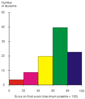
Histograms
A special type of column graph is called a histogram. It must be drawn on graph paper and has the following characteristics:
1. all columns are of equal width 2. no gaps are left between columns 3. each column 'straddles' an x-axis score; that is, the column starts and finishes half way between scores 4. usually a half-interval is left at the beginning and and of the graph. That is, the first score is one unit in from the frequency (y)-axis. |
|
|
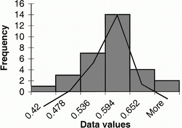
Frequency Polygons
A special type of line graph, called a frequency polygon, has the following characteristics:
1. the frequency polygon uses the same scale axes as the histogram 2. the midpoint of the tops of the histogram columns are joined by straight intervals 3. the polygon is closed by drawing lines at each end down to the score (x)-axis |
Dotplots & Stem-and-Leaf Plots
A dotplot is a simple graphical way to present a small amount of data. Each score in the data set is marked with a dot on the number line.
When displaying data, a stem-and-leaf plot may be used as an alternative to the frequency distribution table. Each piece of data in a stem-and-leaf plot is made up of two components; a stem and a leaf. For example, the value 90 is made up of tens component (the stem) and the units component (the leaf) and would be written as |
|
|
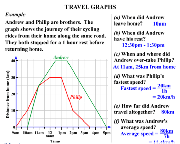
Travel Graphs
A travel graph is used to represent a journey. On the horizontal axis is time while on the vertical axis is distance. The picture at left is an example of a travel graph and all the information that it shows.
|
